
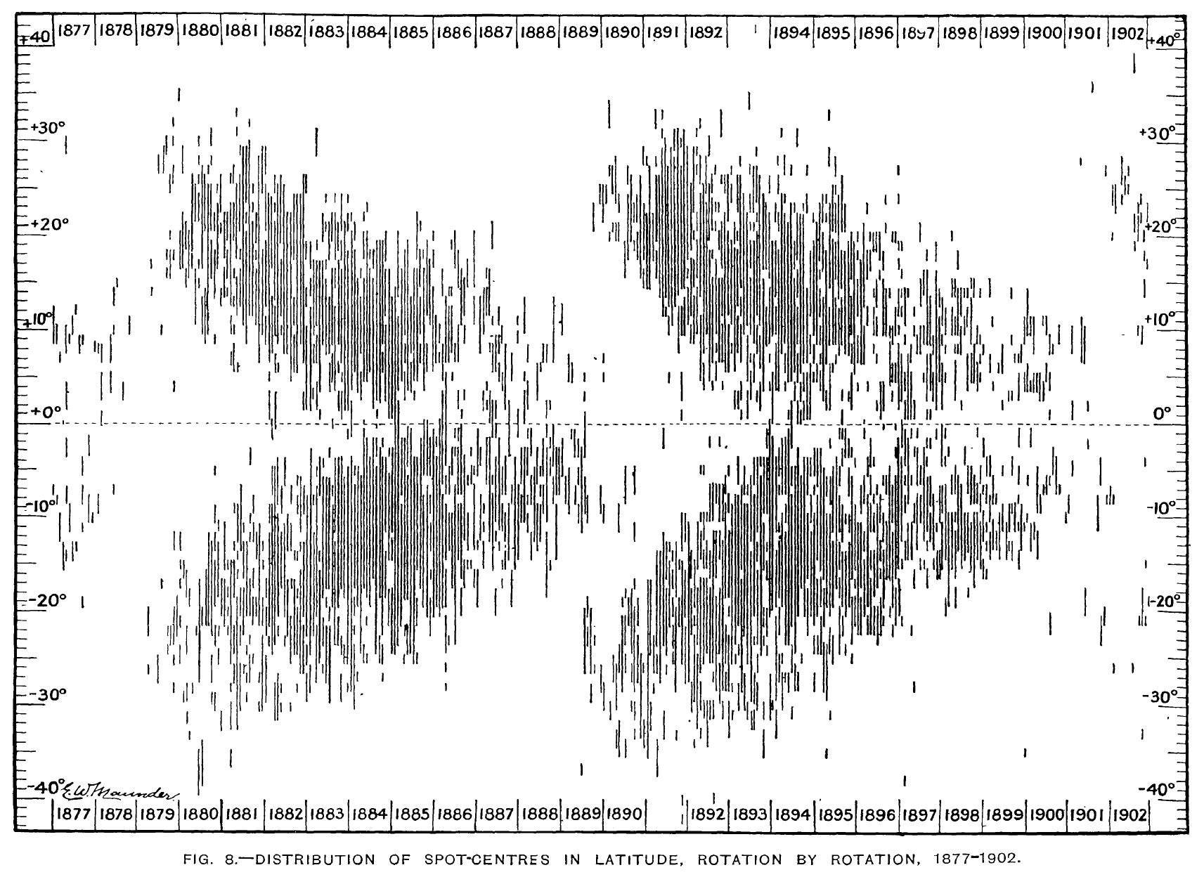
Figura 1: The first butterfly diagram published by Maunder (1904), shows in the years 1877-1902 (x-axis) along two solar cycles the position in latitude (y-axis) of all sunspots detected with respect to the solar equator (horizontal dotted line).
Alessandro Bemporad
The butterfly diagram is a graphical representation created by astronomer Edward Walter Maunder in a 1904 paper to visualize the evolution of sunspots over time and latitude. By plotting the position of sunspots over two solar cycles (about 11 years each), Maunder noted that they appear at higher latitudes at the beginning of a new cycle and then, as the cycle progresses, move toward the equator, creating a characteristic figure on the graph resembling two mirrored butterfly wings. The importance of the butterfly diagram goes far beyond simply tracking sunspots: thanks to the longitudinal average of magnetograms of the photosphere, it shows the evolution of the radial magnetic field over the course of solar cycles, highlighting not only the equatorward migration of active regions and their magnetic fields, but also the magnetic field fluxes that shift toward the poles, contributing to the reversal of polar fields during the solar cycle. This diagram thus plays a central role in solar physics, as it directly links photospheric observations to the dynamics of the global magnetic field, providing fundamental support for solar dynamo models and enriching our understanding of the generation and transport of the solar magnetic field.
For over a century, however, this diagram has allowed the study of only one region of the Sun, the photosphere. This is not only the region where sunspots are observed, but also the only region of the Sun where it has so far been possible to measure the magnetic fields flowing through solar plasmas. Measuring magnetic fields in the Sun’s atmosphere above the photosphere, the solar corona, has been a challenge for decades. The dynamics of coronal plasmas is dominated by magnetic fields, and limited knowledge of them has been one of the main limitations in the study of the solar corona. Many techniques have been developed for this purpose, some of which, however, have allowed for very localized measurements (for example, above sunspots – e.g., Shad et al. 2024) and for short time intervals (at most a few months – e.g., Yang et al. 2024), thus preventing long-term studies (several years) over the entire solar corona.
Now, thanks to a recently published technique (Bemporad 2023), it has finally been possible to study the evolution of the solar corona’s magnetic fields day by day and year by year and begin to understand how the “butterfly” of photospheric magnetic fields modulates the structure of the coronal “butterfly.” The technique is based on the analysis of coronagraphic images (acquired specifically by the coronagraph at the Mauna Loa Observatory in the Hawaiian Islands), from which the evolution of coronal densities is first derived, and then—assuming a principle of equipartition of energy—the gravitational potential energy and magnetic energy of the corona. The technique, successfully applied in the first work to observations acquired during the total solar eclipse of 2017, has now been applied to more than 10 years of coronagraphic observations, covering the entire solar cycle 23 (from late 1998 to late 2008), in a work now in press (Bemporad & Bertone 2025).
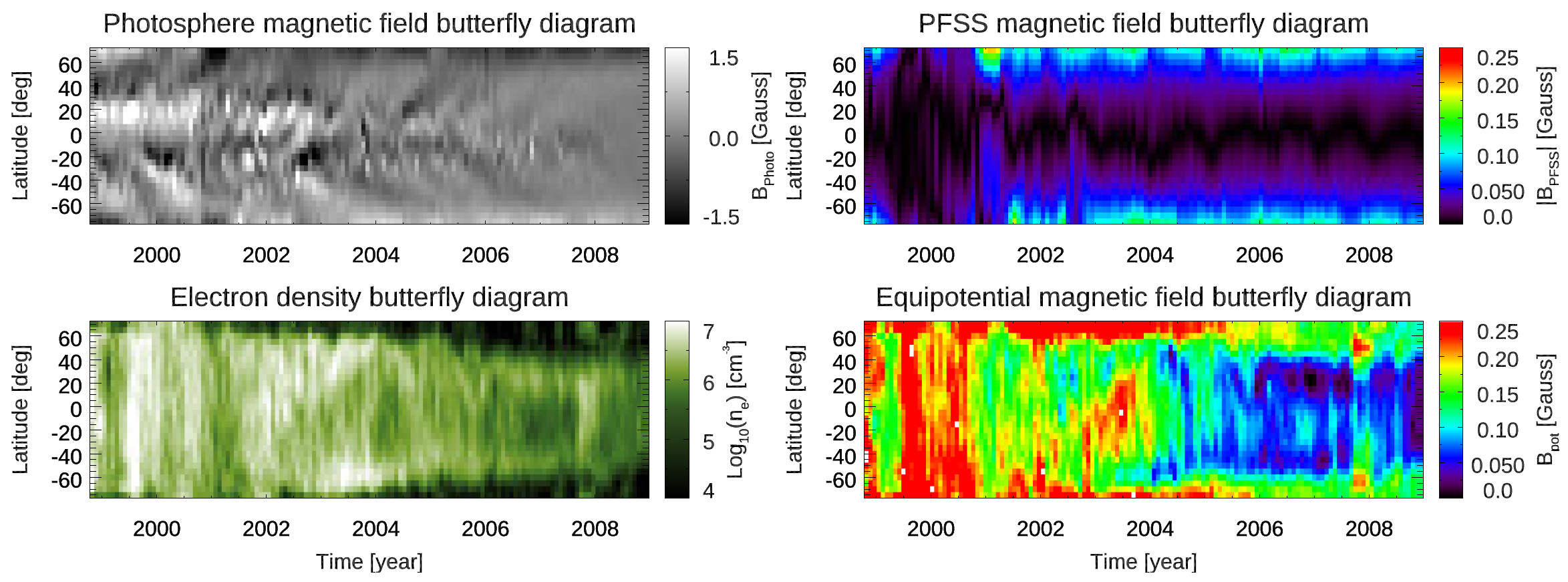
Figura 2: The butterfly diagram of photospheric magnetic fields for solar cycle 23 (top left) and the corresponding butterfly diagram of coronal magnetic fields (bottom right). These maps are compared with the butterfly diagrams of coronal magnetic fields with potential extrapolation (top right) and with the coronal densities (bottom left). In each map, time passes on the x-axis, with the cycle minimum on the right (around 2008), and the cycle maximum on the left (around 2000-2001).
This has allowed the creation of the first-ever butterfly diagrams of coronal magnetic fields across a solar cycle. The results show good agreement around solar minimum between the inferred position of the magnetic neutral line in the corona and the extrapolations of potential-type magnetic fields, an extrapolation whose validity declines at the maximum of the cycle. The coronal butterfly diagrams show the formation of an asymmetric solar corona approaching the 2008 minimum, which is not matched by a similar asymmetry in the evolution of photospheric magnetic fields. The evolution of coronal magnetic energy shows similarities, but also notable differences, compared to photospheric magnetic energy, suggesting a connection between coronal structures and the innermost regions of the solar convective zone. Furthermore, coronal magnetic fields over the polar regions appear to be significantly different and nearly anti-correlated around solar maximum, but become comparable during the descending phases of the cycle.
These results offer a new framework for understanding the modulation of the solar corona by the activity cycle, as well as new perspectives for future observations of the solar poles, which will be acquired for the first time by ESA’s Solar Orbiter mission in the coming years.
For further information, see the full article: A. Bemporad, & S. Bertone, “The solar corona butterfly diagram,” A&A, Forthcoming article, DOI: https://doi.org/10.1051/0004-6361/202555036